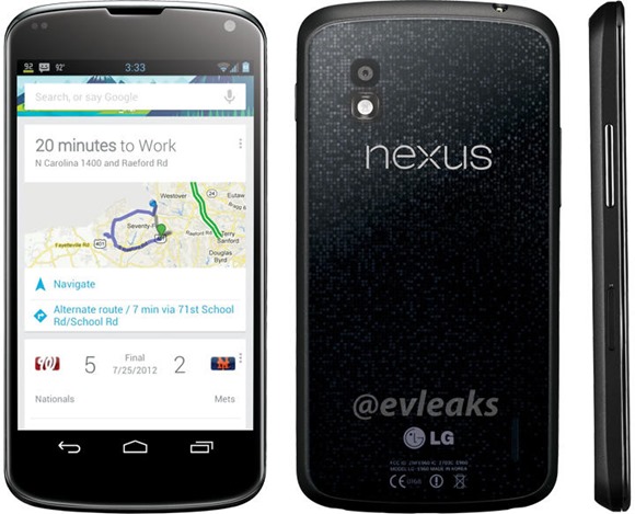
LG Official has recently confirmed Google will be unveiling the new Nexus 4 on October 29th event. LG Nexus 4 hasn’t been exactly the best kept secret. We’ve already seen some Nexus 4 live pics leaking, but its first press shot made its first public appearance via a tweet. Thanks again to @evleaks for providing the final official look of the LG Nexus 4 in its full glory.
Finally, we’ve a more clear look of the upcoming Nexus handset. You can see matrix-like “glittery” pattern with a big “Nexus” logo, instead of the Google logo we’re used to see on the previous Nexus phone. The front side of the phone looks identical to the Galaxy nexus with no buttons. LG has slapped volume rocker, lock key buttons and a slot for micro SIM card on the sides of the device. The battery indicatory is showing how much charge you have left and there’s a new position of clock in center of the notification bar (it could be a screenshot from an AOKP custom ROM). We don’t know why the weather indicator is showing 92 degrees in the notification bar, which seems to be very distrustful.
What do you think? Is the above image real or fake? Is this is how the Nexus 4 looks like?
Nexus 4 is almost confirmed to ship with new Android JB MR1 OS, boasting a 4.7” HD screen, quad-core processor, 2GB RAM, 2100mAh battery, and an 8Mpix camera on back side. It is also rumored to be available both in 8GB and 16GB editions.
LG Nexus 4 has also been benchmarked, beating the Asus Padfone 2, Pantech Vega IM-A850 and Xiomi MI-2 handsets. Android 4.2 running LG Nexus 4 has acquired 30.4 frames per second in the offscreen 1080p Egypt test.
Google is also expected to launch Android 4.2 running Samsung-made Nexus 10 tablet (codenamed “Manta”) at is upcoming event, and the new tablet may sport 2560×1600 pixel (16:10) display with 300 PPI. Of course, don’t be surprised if Google introduces a 32GB Nexus 7 edition at its Android event on October 29th in NYC.
Update
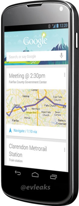
@evelaks has leaked another press render of the LG Nexus handset showing the front side at an angle. You can observe the clock widget has been positioned on the right side in the notification bar and it looks more legit than the previous image
Source: @evleaks, GLbecnhmark


